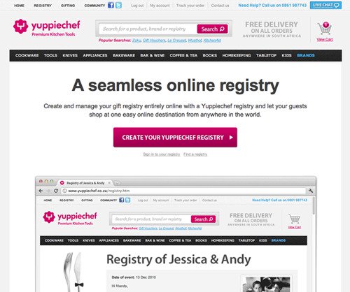
1 Navigation Bar Distraction
When it comes to landing pages, the ultimate goals are to have visitors understand the main message and hopefully execute your request, for example, submitting a form, completing a purchase or downloading something after filling out a form.
Many often misunderstand that landing pages should also have the menu bar, like what is seen on websites, but this actually increases the tendency for visitors to click away from your page or bounce to other pages.
It’s always highly recommended to remove the navigation/menu bar, and not to hyperlink the logo icon too.

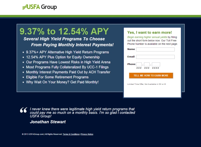
2 Different Text for Call-to-Action Button
To unify the messages of a landing page, always use the same text for all call-to-action buttons. Different text in the CTA button might confuse your audience causing them to become uncertain regarding the main objective of your landing page.
Depending on the design of the page, it’s advised to use the same text, design and colour across the whole landing page as well. This can reduce any friction and make your audience focus on one single thing only.

3 Not Mobile Optimized
When the majority of searches take place on mobile, failing to provide consistent experience across devices can lead to a waste in your ad budget. Thus remember to always preview your landing page on your smartphone before publishing it.
Check the font size, image, or the flow to see if they are able to create a good user experience. If you’re using a landing page builder software, always stick to single column layouts with plenty of whitespace and full-width section.

4 Weak Headlines
Your headlines should include action-oriented words to convey your unique offer that match with your objective. Avoid complicated or confusing words that might weaken the core message.
Everything about your landing page need to be connected and consistent to your headlines.
To keep thing nice and easy, it is better to keep the headline short and precise. Focus on the benefits for visitors and not the features.
Wish to test the score of your headlines? Insert your text here: https://coschedule.com/headline-analyzer
5 Missing Benefits, Testimonials and Social Proofs
Nobody is going to fill out and submit a form if your what you present on the landing page don’t appear appealing to them. Remember, always deliver the message using your audience’s language and avoid jargons that make visitors misinterpret your benefits.
Showcase the best testimonials, social proofs, awards from well-known establishments to convince your potential customers more. Besides, you can also display real data, graph or official recognition to create credibility, trust, and boost customer confidence to increase conversion rates.

6 Slow Loading Time
In today’s digital age, user expectation on loading speed has become more demanding and many landing pages fail in loading speed test. Pages that take longer than 3 seconds to load will lose more than 50% of visitors.
The most common factor that causes slow loading speed is overly large images, or simply too many images. Before uploading any images to your landing page, always resize and compress them according to the layout of your landing page.
There is a great tool to compress images. Try it https://compressor.io

7 Excessive Information to Fill Out
We totally understand the more information we can collect from potential customers, the more we understand about them. However, most visitors feel annoyed when too much time is needed to complete a form.
The rule of thumb is the less number of fields, the higher chances of form submission. For example, if only name and email address are required, visitors would be more willing to fill out and submit. Moreover, removing redundant fields can also reduce distraction and allow your visitors to focus on your landing page content.

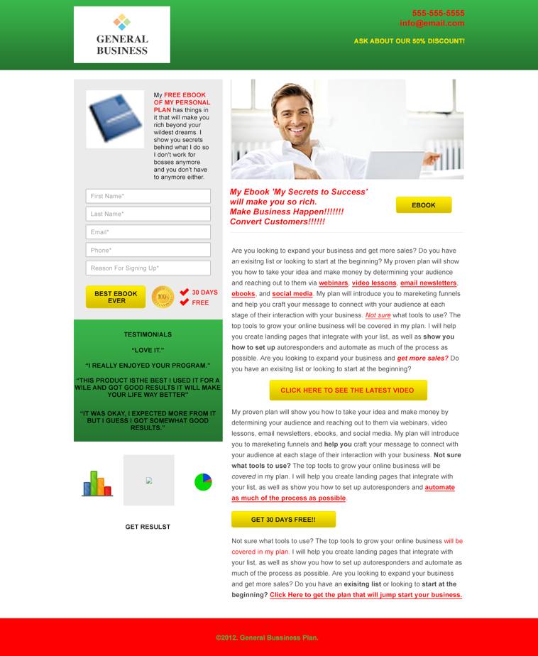
8 Poor Design
The overall design of your landing page has a big impact on your conversion, which is why you need to make sure the design looks attractive, personable, personalized to your target audience.
Don’t use too many types of font, excessive colours that don’t match with your brand. Avoid poor arrangement of your content. Not to forget every good landing page should have enough white space. Sometimes, less is better.
Summary
Generic headlines don’t capture attention or convey why people should care about your products or services in the first place. Not to forget cluttered design with mixed messages — these can confuse your target audience and distract them to complete your request (such as filling out a form).
We hope that the 8 mistakes mentioned above can become a good checklist for you before publishing your digital marketing campaigns. Use the list to help you fine tune your landing pages and eventually increase the conversion rate.
Finally, perfecting a landing page takes lots of A/B testing. Patience is the key. But we promise the reward will be satisfying 🙂
Cheers!